
|
|
I’ve put it off for a while but my laptop was getting extremely sluggish on wakeup and I needed a good reinstall as I’ve installed so much crap it’s unreal. So I figured it’s the perfect chance to try out the evaluation version of Windows 7 that I got some time ago but have not got round to trying. I’ve had a good play with it now so I thought I’d put up a post 🙂
There are a lot of improvements with windows 7 but there are a few things that you will notice more than others and I’ll basically give a run-down of the things that look and feel different in Windows 7.
The first thing you will notice is the task bar, now sports a completely different more compact look and feel, it’s a kind of all in one task bar, system tray & quick launch:

From left to right, the Firefox icon is highlighted, this shows that the program is running. Second along is the Windows explorer icon, this is highlighted but also shows two other boxes behind it, this shows that there are 2 other Windows explorer windows open to make 3 in total. The Windows Media Player icon is there but is not highlighted this is merely “pinned” to the task bar and not running, running it would merely highlight it as the others are. The MSN icon also has 3 boxes indicating it has 3 (or more) windows open.
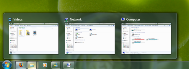
Now instead of the usual vertical menu we’re used to seeing in Vista/XP when you click on a program group you are greeted with thumbnails of each of the windows to choose from. If you mouse over the thumbnail it will hide all other windows on screen and show the one your mouse is over and of course left clicking will select said window.

The notification area (or system tray) has also changed, it will no longer spring out and show all of the icons it now pops up a small window with them all in. I’m not really sure why they have decided to do this as there is a lot more room in 7 for icons on the task bar. I personally prefer it how it was.

Next up it’s Windows Media Player, they have thrown out the glass style “aero” and gone for a light blue scheme, I’m not sure whether I like it or not as it’s a step backwards in a way but still looks nice. Further looking at WMP you can see that video playing is a little different too, all controls have been moved inside the video screen and disappear after a few seconds:

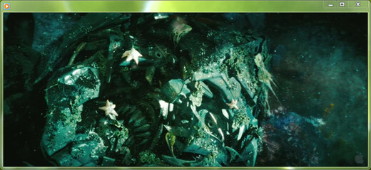
I definitely like this approach and have always wished VLC would do something similar, this side of WMP is a definite improvement. Most everything else is the same in WMP it’s generally just polished, still no aspect ratio support.

On a very quick note I think windows look a lot neater in Windows 7 as in the above screenshot there is less visual clutter and a more refined colour palette. I also like the new folders on the left, a bit more useful than they were in Vista.
A few other feature’s you will notice but I was not able to screenshot very well include the ability to simply drag a window to the top (and touch) of the screen to maximize it, and then if you want to restore it just drag it back down without having to press any of the buttons at the top right. In the same vain if you move your window to the right or the left of the screen it will put the window in half screen mode and take up half of the width of the screen, if you drag it away from the side it will restore to it’s original size and shape. Both are very handy and when you touch the side/top of the screen there’s a nice visual queue indicating that you’re about to carry out the action.
Fingerprint reading is much improved, it’s now built into Windows login and you will not have to install additional software. I have also noticed that it seems a lot more accurate than the previous program I was using making the fingerprint scanner more useful.
The show desktop button is now all the way to the right of the screen and integrated into the task bar, if you mouse over it you will be able to see the desktop in all of it’s glory before deciding if you want to minimize everything.
Gadgets now do not need you to have that ugly black bar on the right hand side of your screen to use them, they are completely free of it now. They are also availible from a simple right click on the desktop, gadgets now show up just above ‘personalize’.
When windows are maximized they now stay glassy and transparent instead of becoming black, as does the task bar, it’s something I’ve always wondered why it was done in vista, and I can’t really decide whether it is an improvement or just a change.
The Start menu is ever so slightly different as are a lot of other visual aspects of 7.
I’ll probably add more to this article at some point, mainly screenshots.